80/20 Rule in
Graphic Design
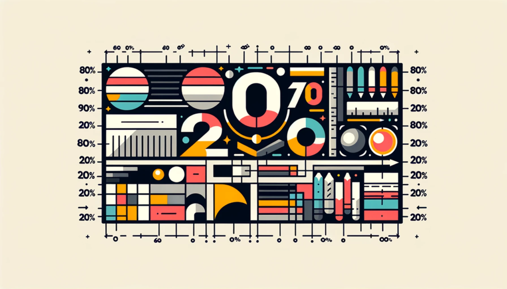
Typography, Color, and Hierarchy That Shape Most Results
Great design looks effortless from the outside, but behind it is a lot of choice and constraint. In most projects, a small number of visual decisions – type, color, layout, imagery – carry most of the impact, while countless tiny tweaks add little. That’s the 80/20 Rule in graphic design: roughly 20% of design elements and decisions create about 80% of how a piece feels and performs.
Once you accept that, you can spend more energy on the vital 20% and less on polishing details that very few people notice.
The Vital 20% in Most Designs
Across posters, landing pages, apps and brands, you’ll see similar patterns:
- Typography and color choices shape 80% of perceived style and mood.
- Hierarchy – what you make big, bold or bright – directs most of where eyes go first.
- One or two key images or illustrations create the main emotional hook.
- Whitespace and alignment make the difference between “clean” and “messy.”
Spending more time on these core elements yields far more payoff than endlessly tweaking secondary icons or micro‑details.
Step 1: Clarify the One Message and One Action
Before moving pixels, you need clarity: what should the viewer understand and do?
- Write down the single most important message (the top 20% of content that carries 80% of meaning).
- Decide the primary action: click, sign up, read more, remember a date, feel a brand’s vibe.
- Let every layout and style decision support that message and action first.
Real-life example: A cluttered event poster became far more effective after the designer focused on just three elements: event name, date/location, and one strong image. Everything else moved to secondary positions or a website link.
8020 move: At the start of each project, write a one‑sentence brief and keep it visible while you design. If an element doesn’t support that sentence, question whether it belongs.
Step 2: Let Type, Color and Hierarchy Do the Heavy Lifting
Instead of chasing endless variations, pick a small, intentional system and stick to it.
- Choose 1–2 main typefaces with clear roles (headlines vs. body).
- Build a minimal color palette (e.g. a primary, a secondary, a neutral) and use tints/shades.
- Define a few heading sizes and weights that create a clear ladder of importance.
Real-life example: A landing page redesign that kept content the same but simplified fonts and colors into a tighter system saw improved readability and conversions, even before any UX changes.
8020 move: Spend more time upfront on your type and color system than on individual decorative flourishes. That small set of rules will influence 80% of how the design feels.
Step 3: Use Layout and Whitespace to Guide the Eye
Viewers rarely read every word; they scan for what stands out. Smart layout and whitespace turn that scanning into a guided journey.
- Group related elements and separate unrelated ones; proximity suggests relationship.
- Leave generous space around key content so it can “breathe.”
- Align elements to a simple grid; consistency creates a calm, professional feel.
Real-life example: By increasing margins and tightening alignment on just a few key blocks, a dashboard became much easier to scan, even though the same data was shown.
8020 move: When a design feels busy, try removing or shrinking secondary items and increasing whitespace before adding anything new.
Step 4: Build a Portfolio Around Your Best 20% Work
Your portfolio doesn’t need to show everything you’ve done. A small set of strong, relevant pieces can attract most of your opportunities.
- Curate projects that match the kind of work and clients you want more of.
- For each, explain the problem, constraints, and how your design choices solved them.
- Retire older pieces that no longer represent your best style or thinking.
Real-life example: After trimming her portfolio from 40 projects to 10 deep case studies, a freelance designer noticed that inquiries became more aligned with her ideal clients and budgets.
8020 move: Audit your portfolio and keep only the top 20% of pieces that have led to good clients or that best show the direction you want to grow.
Designing with an 80/20 Mindset
Graphic design will always involve details, but not all details are equal. By clarifying the main message, building a simple visual system, using hierarchy and whitespace wisely, and curating your strongest work, you put most of your effort into the elements that shape how people see and respond to your designs.
The 80/20 Rule doesn’t mean ignoring craft; it means practicing it where it counts most, so your time and talent turn into designs that actually work in the real world.